Purgatory is Asda at Night

All these images were made digitally using found photos and photoshop, inspired by late night visits to Asda back home – in which Asda feels like a completely different place. It feels like a different realm of existence past 11pm.

jellies @ adsa

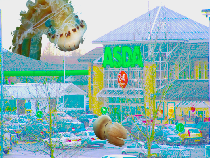
This image was made using a photograph of the Asda nearest to my house, and the Asda that I visit/have visited most often. I played with the image using the adjustment tools to alter the colours and saturation of the original photo. I added in the jellyfish as I have a phobia of jellies, and I feel like they’re what would exist in my own purgatory.

slugs

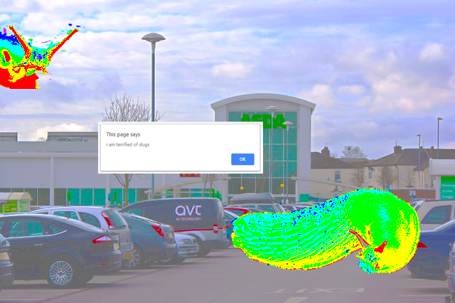
This is another Asda that I’ve visited a lot, though not often. I edited the slugs too this time, I hate slugs so much. I also wrote a JavaScript to pop up and then took a screenshot to edit into this image.

purgatory

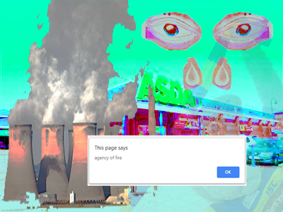
This image is unfortunately very very low quality, it’s also very Warrington specific as that’s where I’m from. Warrington is quite a purgatory but I love it. I had the pop up this time say “agency of fire” as this is what purification is achieved by (according to Wikipedia which is always correct). I also edited in Fiddler’s Ferry which I used to live nearby, edited in the Pink Eye (x2) and a translucent Wolfie. This Asda is in Warrington town. This is my favourite of the 3 images I think, though it may be the lowest quality in terms of it’s resolution and in terms of it’s content.

Items

Sketched ideas for items in the shop that the player can pick up, the items could be 3D models (like the DNA milk that had previously been made in collaboration with a friend), or could be presented as these sketches, or better drawings/paintings. This was made on Photoshop using the mouse trackpad on my laptop. They’re just rough ideas and can be altered and changed.

The items will have a small description when picked up by the player with some hints towards some sort of narrative, as the game itself lacks narrative.

Layout

This is my rough idea for the layout of the supermarket, I drew this quickly on Photoshop to help me understand and visualise what I’d write for the “game”. The yellow icon is where the player starts, the coloured arrows indicate what “move” the player is on, and the red icons are proposed item locations.

I could possibly have the map be an item in the game that could be discovered, just to help the player locate themselves and know where they are. Though this would contradict my idea of navigating a space without seeing the space. Additionally, the coloured arrows only indicate if the player were to directly head towards the exit of the shop (shown by the grey rectangle in the bottom right corner of the map). The player should be able to backtrack on their steps so that they are given the opportunity to collect all items if they desire.

DNA Milk Carton

Gif-1

This is a rotating DNA milk carton made on blender with my friend/housemate. I designed the original concept and asked for help with making it as a 3D Model as I am not as familiar with blender and how it works as him.

This could be one of the items used in the supermarket, and has inspired me to make more items for the “game”. Additionally, this modelĀ  is what inspired me to make a supermarket to begin with.